Case Studies
Rebel Petal


Graphic Design: Logo & Brand Identity
Challenge
A local flower shop, based in Manotick, needed a logo and brand identity. The owner wanted to express her personality, non-traditional, funky, and a little unconventional. With a name like Rebel Petal, the brand needed to have that same edge.
This project was completed during an internship at Cayenne Creative. Several designers, including myself, presented intial concepts and mine was chosen by the client.
Process
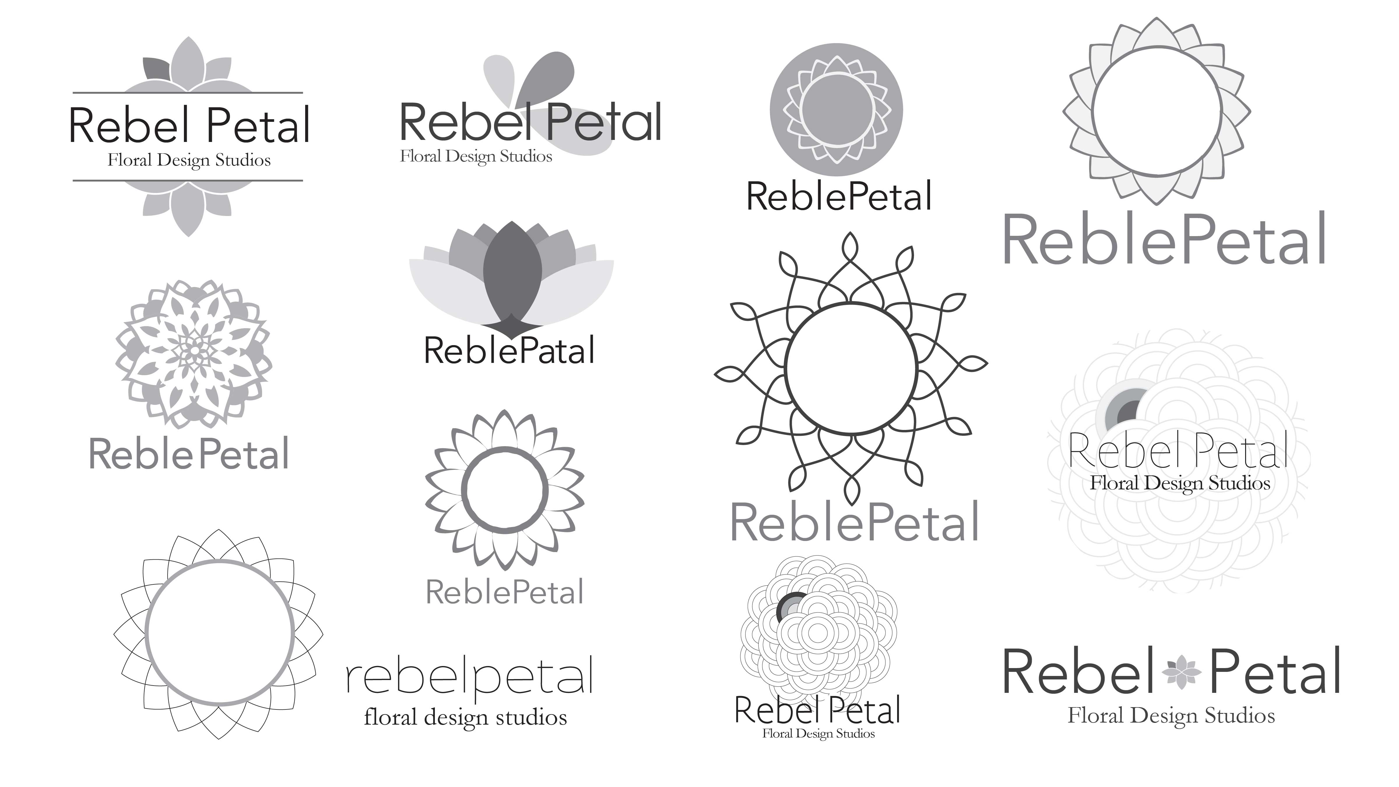
We began with a briefing from the client about her buisness, to get a better understanding of her needs, likes and dislikes. She shared some examples of work she liked. One of these pieces had a mandala design that she was fond of, and I used this as a starting point. I did a number of rough sketches around the mandala theme and developed others that came out of this process, which I reviewed with the Art Director, and we chose one of my sketches to prepare for the client presentation.
Rough Concepts
Final Steps
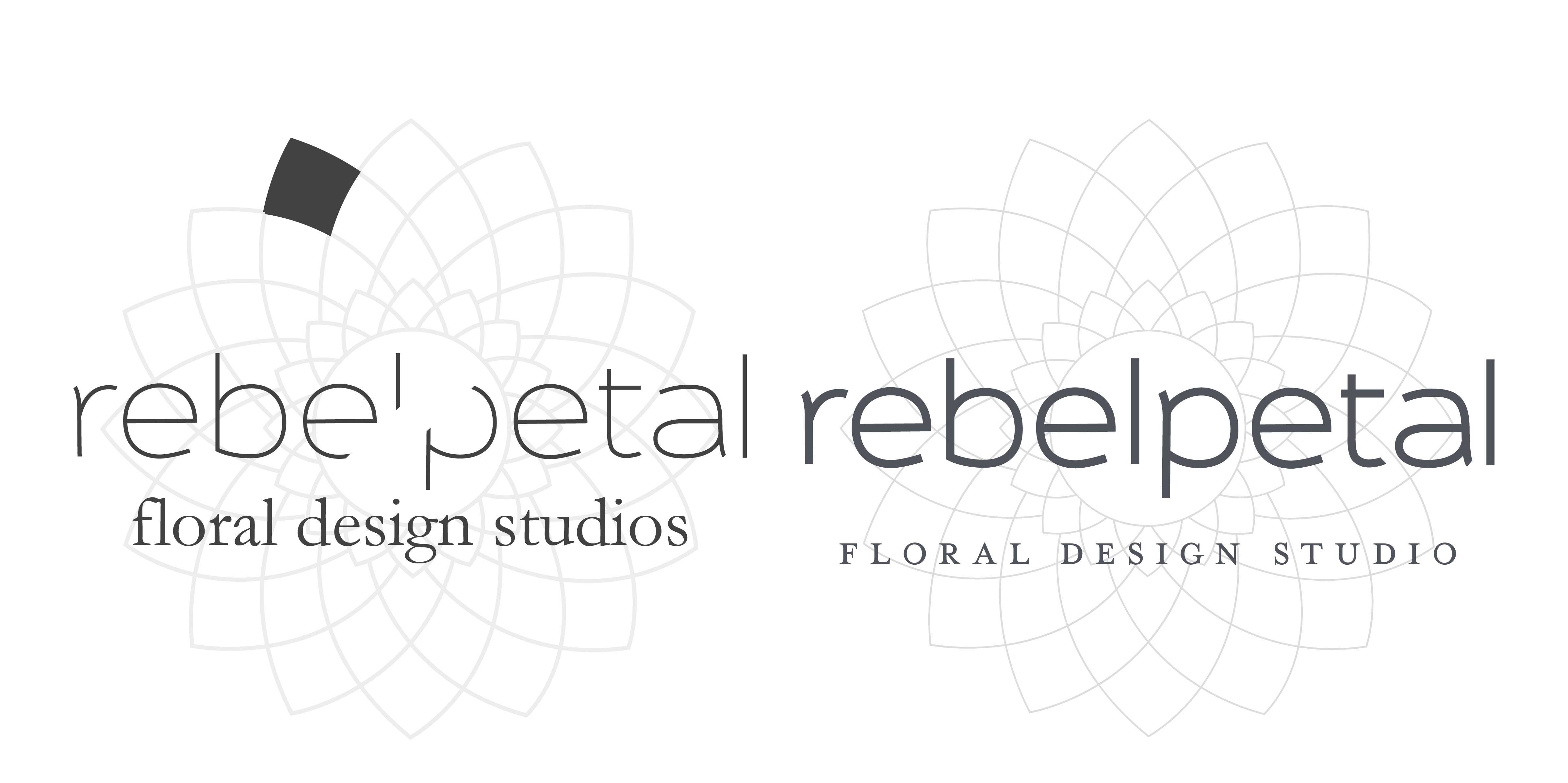
This was the final logo design (left) presented with others to the client. This concept was chosen and a she provided feedback for final revision. Along with these small details, it was decided, that the filled in petal and the cutout on the wordmark was unneccessary to portray the feel of the company. So we simply took it all out. This left us with an elegant yet edgy logo. And the client loved it!
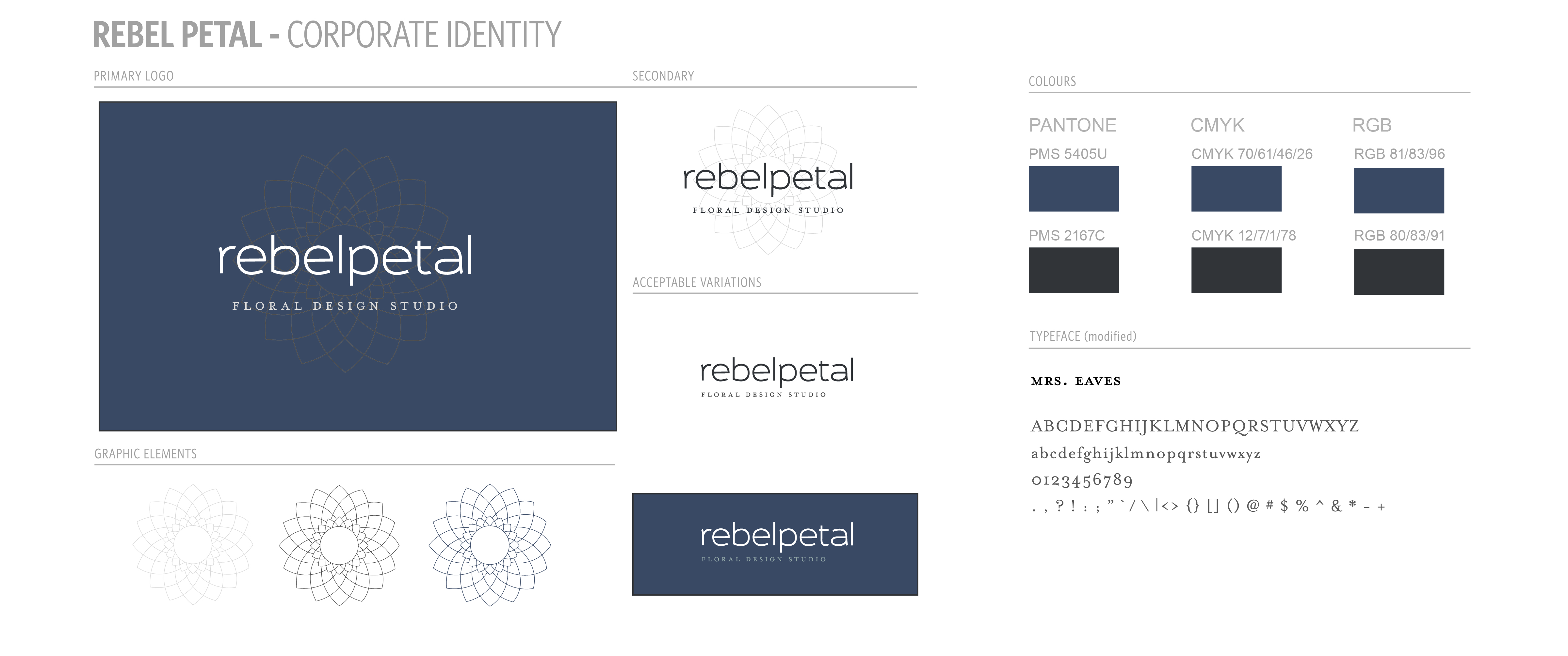
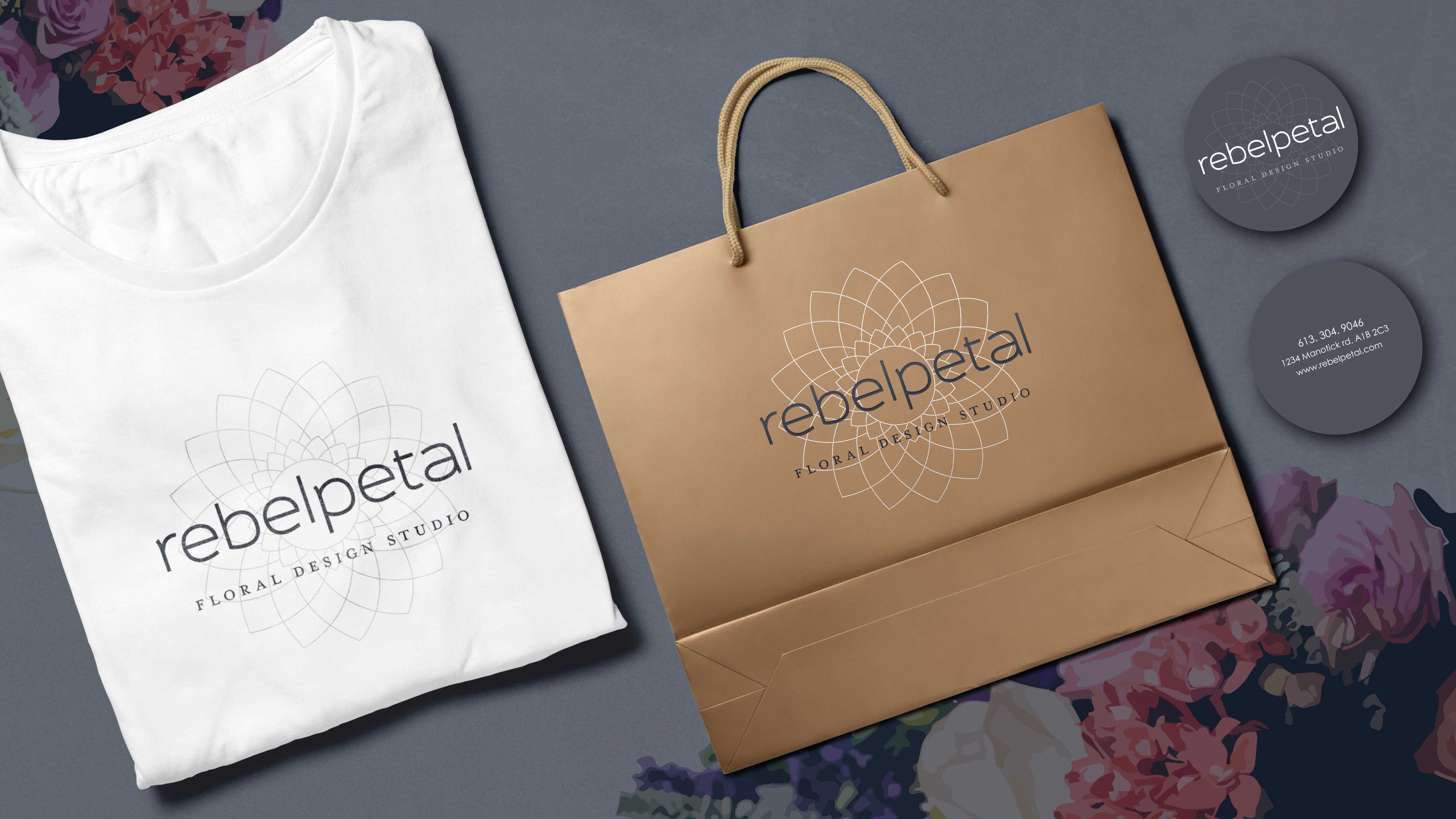
The flower mandala has pointed ends and sharp corners for edginess, and a sans serif font, with slight curves, to mirror the curves of the flower. I used a more traditional serif font in the wordmark to create contrast, and to add a little femininity and formality. Upon final approval of the logo, I, then developed a full brand identity including different logo variations, fonts, colours, and a business card design.