Case Studies
Makhaya Design


Graphic Design: Logo & Brand Identity
Challenge
While doing my internship at McMillan, they had a small client come to them requesting a brand. The project was given to the other intern and I. We each had to create a brand concept for the client, and she would choose which one to use at the end.
Her business is called Makhaya Design. It is an interior design store/ small coffee shop. She also teaches interior design lessons. Some of the words she used to describe what she wanted where: clean and clear lines, Bauhaus style, post-modern, and industrial style.
Process
Based on her brief, I started looking on Pinterest for any inspiration, made a couple moodboards, did a ton of sketches, and ended up with two final concepts. I worked with an art director to improve my concepts and to get them ready to show the client. The concepts were presented and she ended up picking one of mine. The more minimalistic, industrial style one.
Sketches
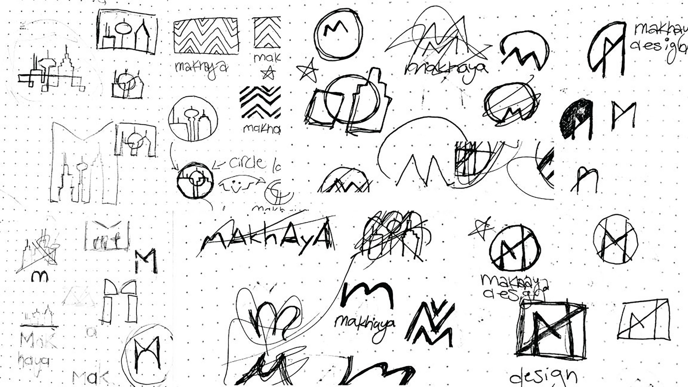
Two Concepts
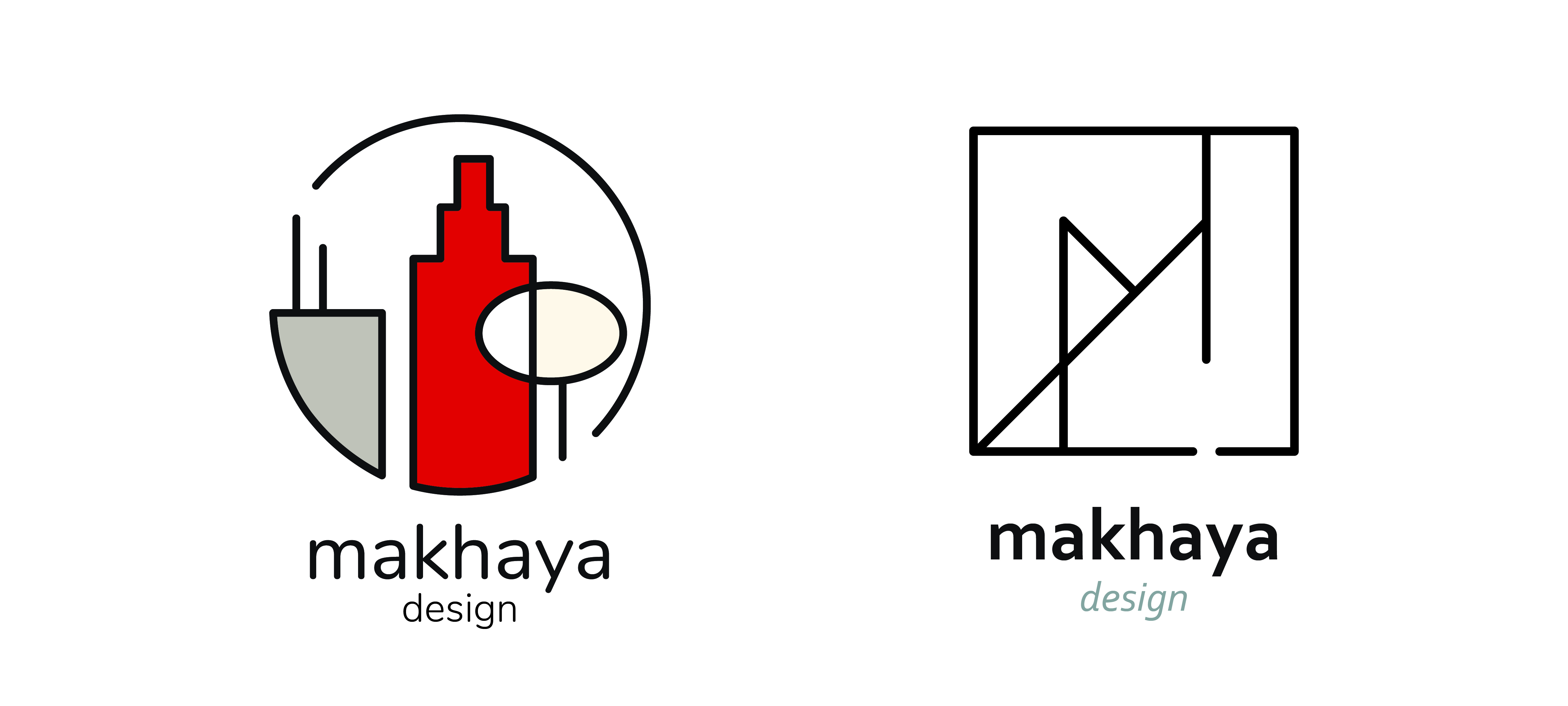
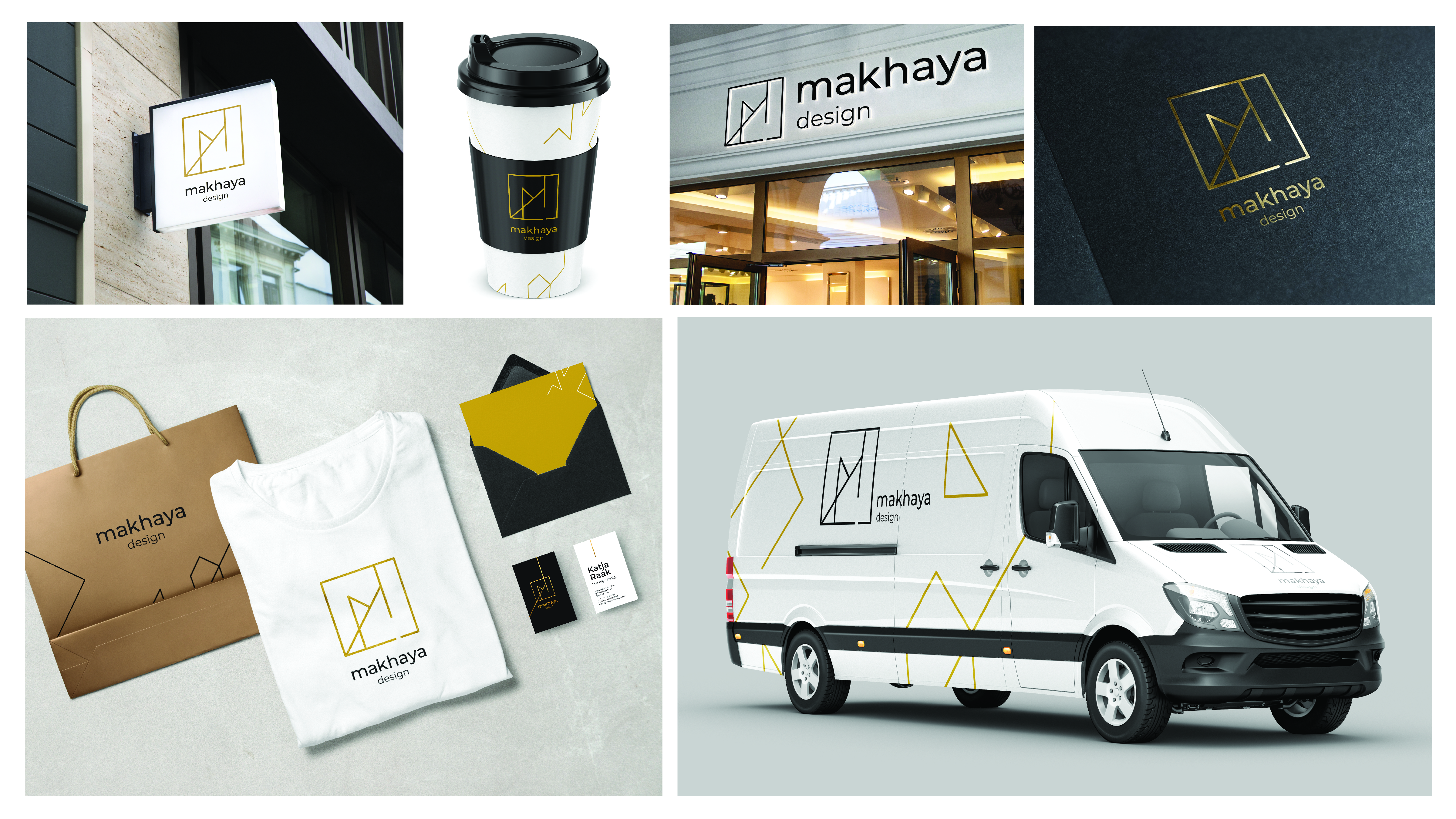
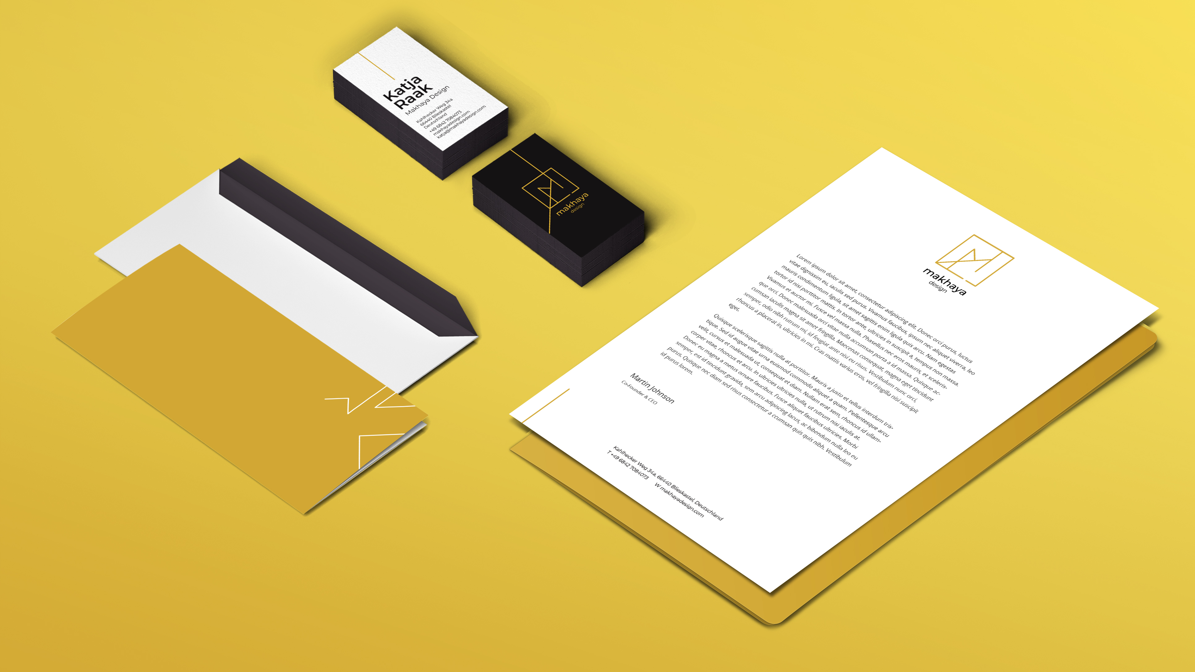
Final Brand
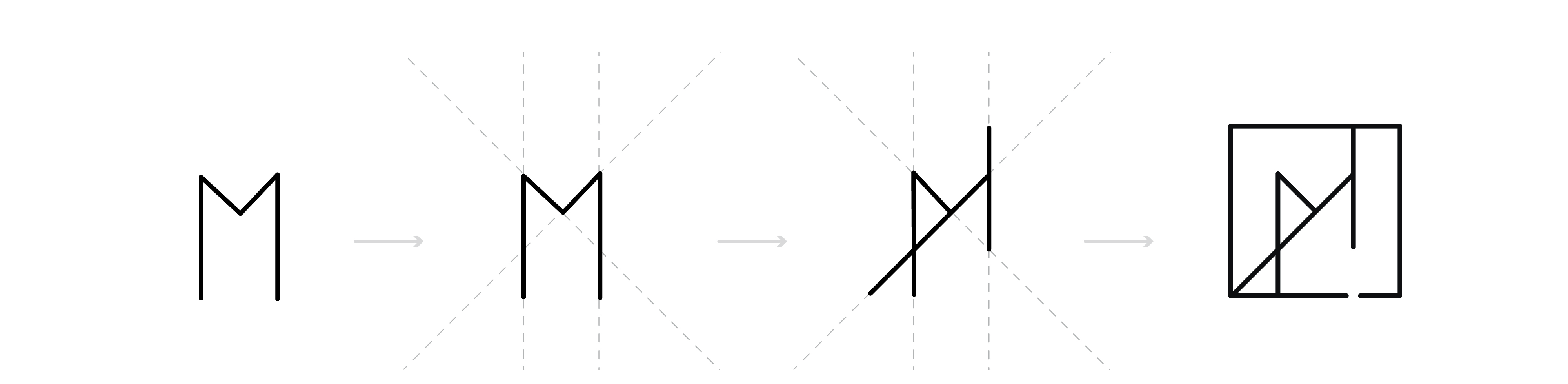
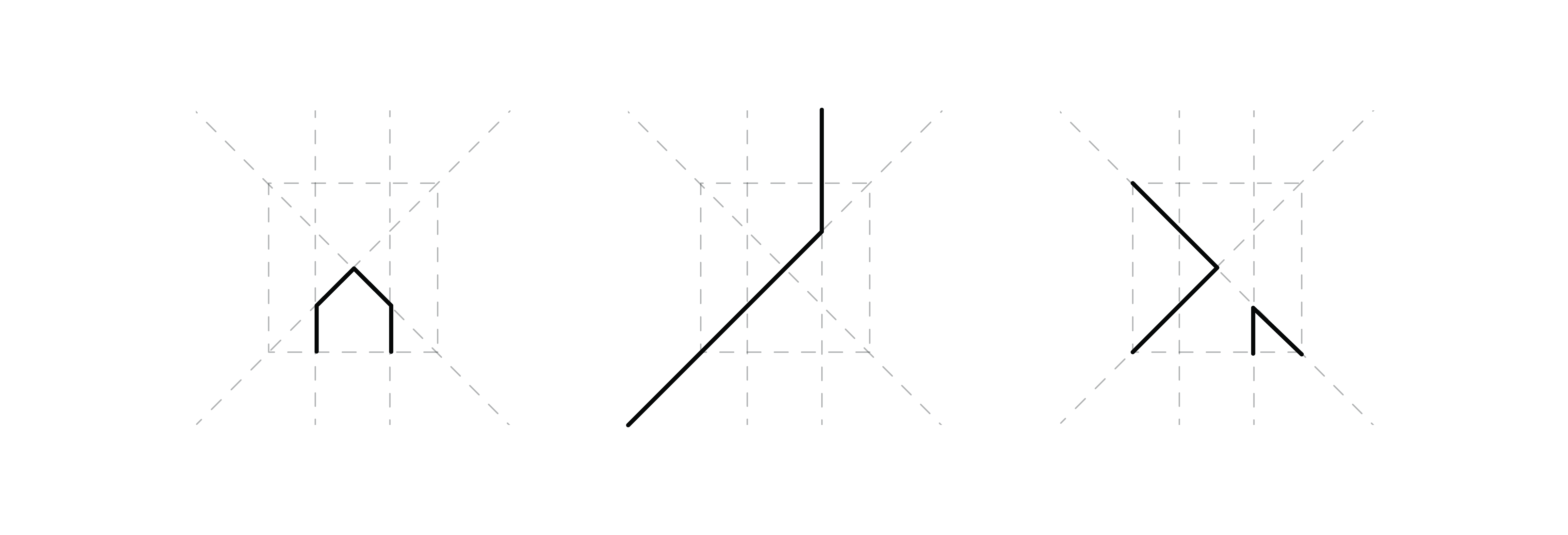
The logo is an "M" for Makhaya. I wanted it to be linear and minimalistic. I started with a simple "M" in a box and realized if I extended the lines of it, I could create a more interesting shape for the logo. This grid can be used to make many other graphic shapes. These shapes are used as a graphic element for the brand.
I added the gap in the line at the bottom of the box to open up the logo more. When it was closed it looked too clunky, and I was aiming for minimalism.
The client wanted to see the brand in black and gold. I did that, and changed the fonts a little to suit the new look better.