Case Studies
ThermoSet


App Concept, Design & Prototype
Challenge
I was tasked with creating a mobile application that makes it easy for the user to change the temperature of their house from any location, helping them to be more cost efficient and comfortable.
Solution
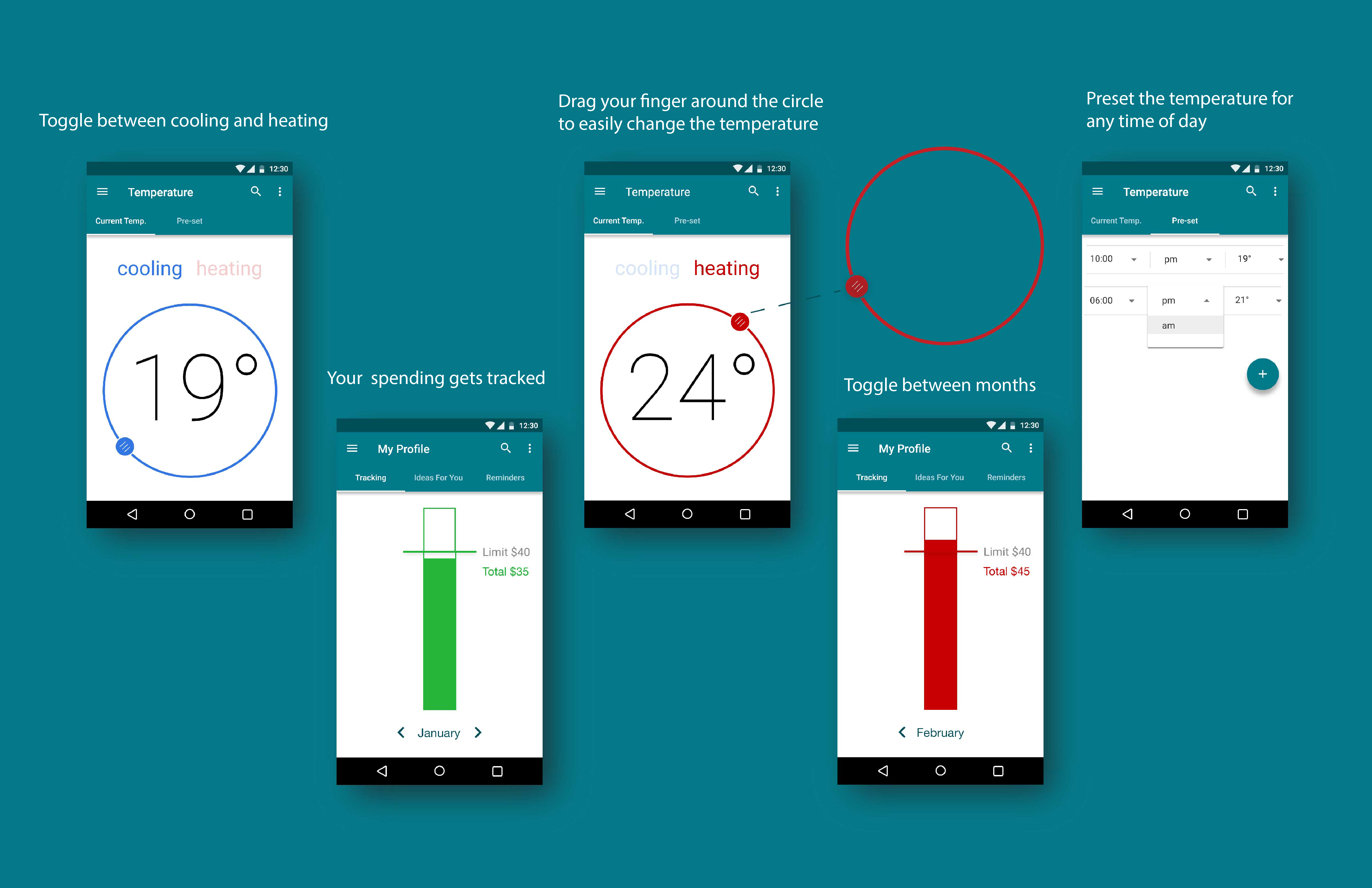
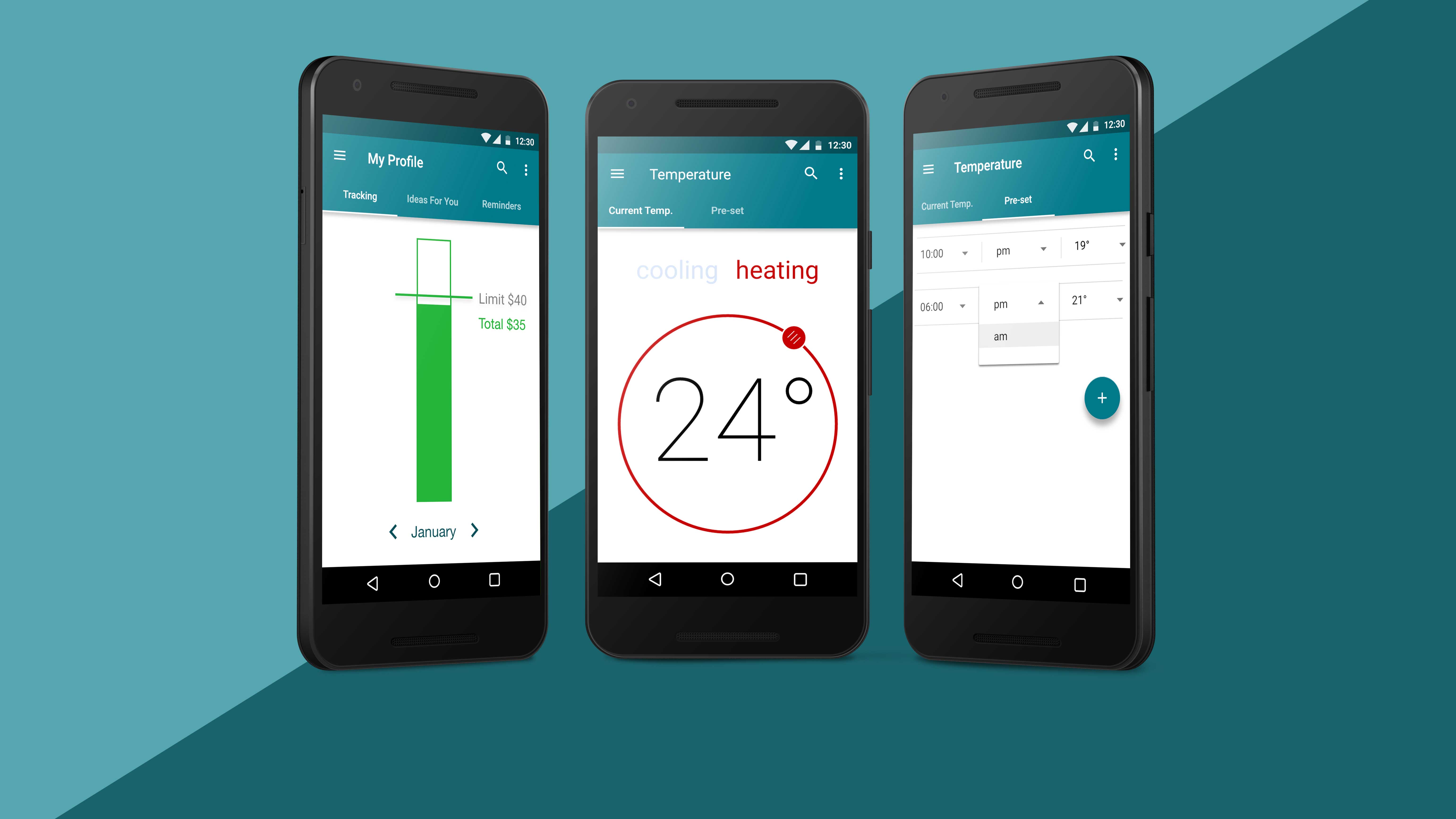
I came up with a concept that allows the user to adjust the temperature from any location and tracks their spending so that they can save money. I named this app ThermoSet. It is simple, clear, and descriptive. Using ThermoSet you can change the temperature of your home in one click. And you can do it from any location. ThermoSet allows you to easily preset the temperature, set a personal limit for each month, and track your spending so that you can minimize your monthly costs.
Process
The target audience is middle-aged people with a good income. The visual design of this App is very clean with a lot of white space; professional and easy to understand. It is quick and easy to use for busy people like the personas I created.
I imagined the kinds of people that would use this app. I created two different personas:
- 1. Sarah is 37, has three kids and a husband. She is so busy, often rushing her kids all over the place to their activities. She is often only in and out of the house briefly. She is too busy to think about the temperature of the house, so Sarah wastes money on heating and cooling when she isn’t even in the house.
- 2. Dan Smith is a man in his early 50’s. He is divorced and his kids have grown up and moved out. He travels for his job often, and with little notice. Dan is always so busy with work that is always leaving the heating or cooling on by accident. He needs a way to remotely adjust it when he leaves his house.
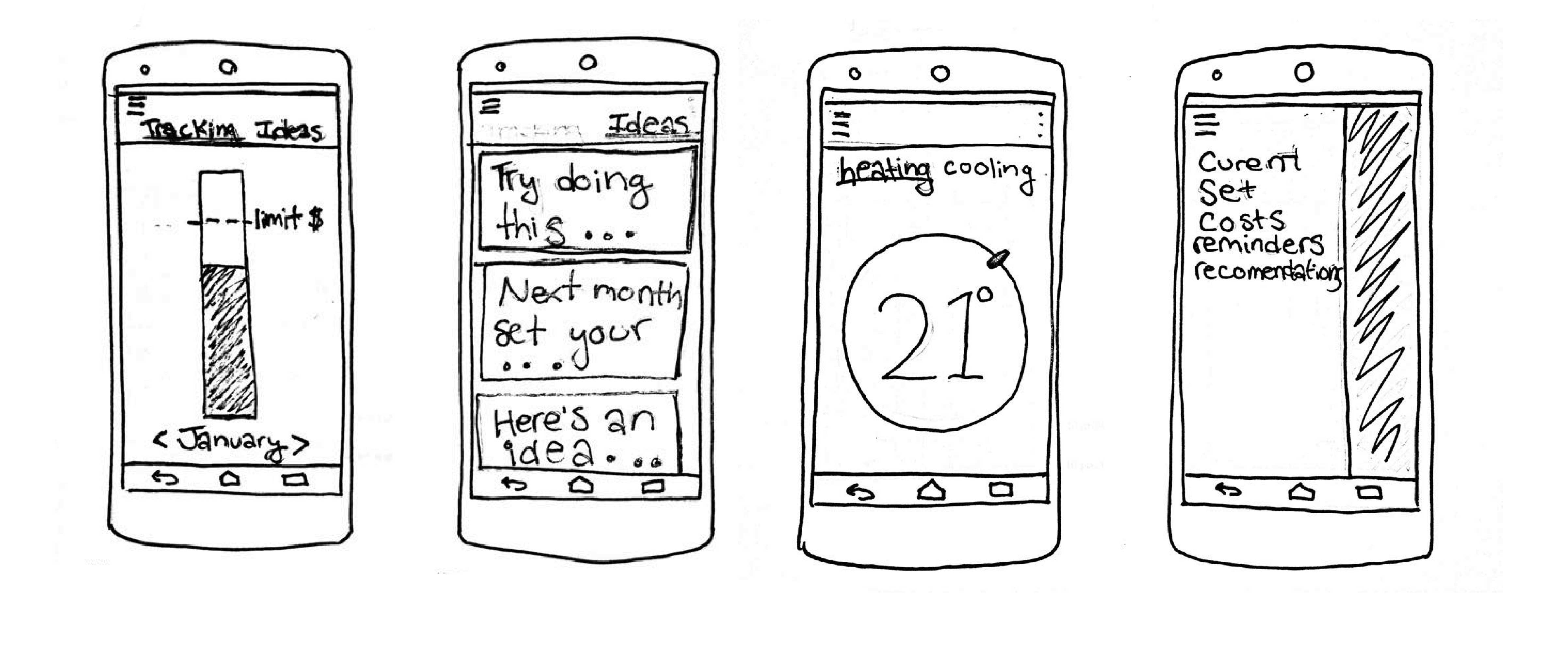
Using these personas, I created a list of app functions that would be helpful for Sarah and Dan. I used this to start sketching app flows and overall app concept.
Sketches
Design Details
The design interface is very simple. ThermoSet was designed for use on an Android phone. To ensure that the user experience was effective, I used Material Design, the Android specification guide for my design. I chose the circular shape to mimic a traditional thermostat dial, so that it was inutitive for the user. I chose red to represent heat, blue to represent cold, green to highlight energy savings, and red to indicate over limit - all commonly understood industry standards.